OCAS · OntarioColleges.ca native app, iOS and Android · 2014 to 2015
The gate on a $1.3M build
Context and stakes
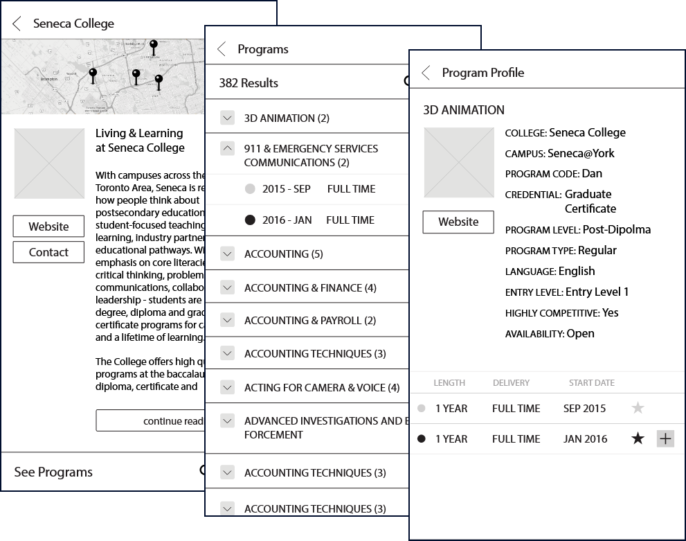
OCAS runs the shared application service used by applicants to Ontario's public colleges, and OntarioColleges.ca is the front door to it. The project was a native iOS and Android app for that front door: research colleges, browse and filter programs, save favourites, and start or continue an application from a phone. The budget was $1.3M. An external agency was contracted to build it. This was a large native build for a public service with a broad, mostly non-expert audience, leaving little tolerance for confusing screens. My job was to make sure a confusing screen did not ship.
My role
Sole UX lead, with gating authority at every stage. In practice that meant the OCAS project manager and the agency routed the work through me, and nothing advanced from one stage to the next until it met the UX and UI bar. The bar was not taste. It came from two places: data out of one-on-one usability sessions, and heuristics from the training I had done with Nielsen Norman Group and Human Factors International. When the work failed on either, it went back.
A gate you never close is not a gate. The job was being willing to close it.
What I built or changed
The mechanism was staged sign-off across the year-long project. The agency worked in sets, each set a package of screens and behaviours submitted for approval before the next stage could proceed. A set did not move to mockups, and mockups did not move to build, until I signed off. That is most of design governance in one sentence: a standard, and someone whose job is to hold the work against it while a schedule pushes the other way.
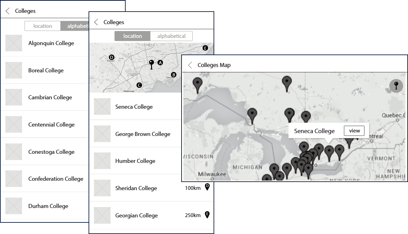
One small change illustrates the method. The colleges were listed in a way that made anything past the first few hard to find on a phone, because the logos ate the space. We shrank the graphics and enlarged the actual school names. People started browsing faster and finding the school they came for. Minor on paper, system-level in effect, and exactly the kind of thing a usability session surfaces and taste does not.
The native decisions were the ones worth protecting: location-based sorting so the nearest colleges surfaced first with live distances, a full province map with tappable pins, favourites that saved instantly, a swipe to remove, and an application flow that lived inside the app rather than bouncing out to a browser. None of these capabilities were free, and each was vulnerable to being cut when the schedule tightened.
Outcomes and open threads
It shipped to the App Store and Google Play. Mobile use for browsing programs increased after launch, and the app gave OCAS better analytics on what applicants were actually looking for, which fed back into how the service was run.
The open thread is what came after. OCAS has since replaced the native app with a browser-wrapped website under new branding. My read, and it is a read rather than an audit, is that some real functionality thinned in the move. The things a wrap struggles to keep are the things this app was built around: location-aware sorting and live distances, a responsive map with pins, favourites that respond instantly, native gestures like swipe to remove, and the general smoothness of browsing and filtering hundreds of programs. A wrapped site can approximate all of it. It rarely feels the same.